
 The inspiration for this layout is a wonderful photo of my son taken in 1988, enjoying warm weather & one of the best summer activities... the Slip n Slide!!! I love this photo & wanted to do a layout showcasing the great colors of summer & fun times! I searched for the perfect papers & found the Kensington Garden Collection by Cloud 9 Design & knew they were the ones! I also used solid green & yellow card stock. The green is from DCWV -Jewel tones & the yellow is from Bazzill.
 My large flowers were made by using the papers from the Kensington Garden Collection & the solid card stock. I made my layers using a combo of hand punches & my Sizzix Big Shot. All layers were distressed using Worn Lipstick & Shabby Shutters Distress Ink. I added a flower brad as the center with a drop of lime green Stickles in the middle. The flower was also highlighted with lime green Stickles.
 The title work is made by Basic Grey, Wilma raw chip alphabet. I inked it with Adirondack Citrus ink & then lightly with the Shabby Shutters Distress Ink. I spot brushed a bit of lime green Stickles to pick up the light.
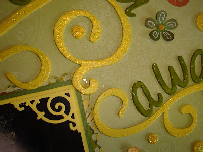 I wanted the flourishes to have a slippery slide feel to them! I used Rusty Pickle flourishes that I had painted with Making Memories yellow paint. I then brushed on yellow Stickles. The decorative corner accents were made with my Big Shot using a Sizzlit accent die. I added several size round chip circles-also painted yellow throughout the layout to fill some holes!
 Small flowers were made using a small Retro punch. I doodled the petals & attached with a brad & drop of yellow Stickles. I made 2 scalloped borders from yellow card stock with my Fiskars Effervescent punch. I also did this for a mat under the pic. The borders were distressed with Worn Lipstick & Shabby Shutters Distress Ink.
 I had soooo much fun doing this that I almost forgot the snow in the forcast Saturday! For a few hours I was transported back in time to a warm summer day, enjoying my sons youth!
Thanks so much for taking a look! It is always appreciated!


 Now try it on button & raw chip too!! You will soon seen how easy this is to work with! Just be sure to cover your work surface!!
 Here are the finished jewels!! Lovin the bling & REALLY lovin the Alcohol...Alcohol ink that is!
 The inspiration for this layout is those beautiful Love Letters papers by My Little Yellow Bicycle & of course this wonderful photo of my son & his new bride! This photo was taken by a groomsman. He took some wonderful pics! We are lucky to have his great photos in addition to the professional work!! The layout was made with the February kit for
  I punched a 3" strip of card stock on both sides with a Fiskars threading water punch to make the large black paper layer. A decorative strip cut with my Sizzix Big Shot from red card stock & was adhered on top. I scattered small paper flowers lightly distressed with fired brick Distress Ink on the decorative flourish & added red jewels as flower centers. These flowers were found in the bridal aisle in a tin, & are made for "table confetti". Check those bridal aisles ladies...lots of good finds!!!
 I placed a punched border strip of red card stock. I added some Clear Cuts flourishes & some Love Letters journaling to the photo. Both of these are made by My Little Yellow Bicycle. The mat for the photo was originally a large "shield" paper that I cut to fit as a mat for the photo.
 The inspiration for this layout is my sweet hubby! The pic was taken in Oct 2008 while we were in Las Vegas for our 30th Anniversary! ( Yes 30 years!!!!) We had a great time! He is truly my best friend & SoulMate! I did this layout for the Feb sketch challenge on My Creative Scrapbook, based on the great sketch by
 The large flourish is from Fancy Pants & was inked with Distress black soot. I scattered the flowers about the flourish to give it a vine-y feel! The paper was distressed with the faded denim ink. I doubled matted the photo & then added a punched edge using the Fiskars border punch.
 The white title letters are made by Heidi Swapp, I added a little bit of diamond Stickles to pick up the stars in the paper. The flourishes & chip stars are also from a line called "Starry Night", only these are made by Rusty Pickle! I inked the flourishes with Adirondack cranberry ink, then brushed on some Xmas Red Stickles. White opal Pearl Drops were added to break up all the red.
 The inspiration for this layout is the beautiful "Love Letters" papers made by Little Yellow Bicycle. Love Letters was the featured collection in the Feb kit from
  The flowers are layered with Prima sweetheart flowers & paper layers that I made from the papers used in the layout. I tinted silver heart brads to be used as flower centers, red & black with alcohol ink to match the papers. The key & heart were found at local craft store in the bridal section. If you have never checked the bridal department for scrap booking supplies you should give it a try! Tons of fun items!
 The title work is BasicGrey Wilma raw chip board. I inked them with Adirondack cranberry ink & then stickled them with Burgundy Stickles. Since I wanted overall coverage with the Stickles, I applied them with a paintbrush. The beautiful background paper is made by Hambly -the screen print line-Brocade.It is a yummy two toned black paper!!
  I punched papers with the Fiskars sunburst punch to make mat under photo. It was distressed with fired brick & black soot Distress ink. I used the same paper to cover a chip heart & inked the edge. I then added a rub on to the photo & placed the flower over the rub on to give it a finished look.
 I used a large sticker from the Love Letters line as a base to my flower. I then made layers & placed the finished large bloom where it looks as if it is a part of the large sticker. Small flower were made with the Retro punch & tiny flower punch. Lastly I cut a large Prima crystal flourish in many pieces & placed them around the flowers in the layout! This was a fun layout to do! The papers did most of the work!
 The inspiration for this layout is an old photo I found. I would love to know who they are & why we have the photo. When did they come to the United States? What did they do to earn a living? In the big scheme of things it is not that long ago... they are not just Faces!
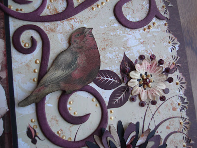 The Maya Road flourishes were inked with Tim Holtz Rum Raisin alcohol ink. The bird was printed on cards stock, hand cut & distressed. I placed it on the a flourish to give it sort of a bird on branch appearance. The bird from
 The silk Prima flowers were lightly distressed. I then added flower layers that I made with my Big Shot using papers in the layout. All bloom edges were inked lightly. I then added them to the flourishes in the pattern paper to give them a cluster feel! Fired Brick Stickles were used to highlight & Ranger gold Liquid Pearls were used as flower centers.
 The inspiration for this layout is my wonderful son & hubby! The photo was taken on Nicks wedding day as they were starting to get ready for the big event! My hubby was Nick best man... that was soooo special! Nick really is a chip off the old block! They are both great guys!
 The photo was matted using card stock & Fiskars effervescent border punch. I distressed all raw edges with Distress walnut stain & Rangers Prussian Blue From the Nick Bantock line. If you are not familiar with the
  The paper edges were punched with threading water punch & distressed with the walnut stain/ The Fancy Pants flourishes & Maya Road alpha were inked with the Prussian Blues ink. I added a few blue jewels to the circle to bring the blues into the papers.
 The flower were made with a retro punch as the base, layered with papers used in layout & cut with my Big Shot. I added a small retro punch on the top & attached with a brad. All edges were distressed with the inks. I added a few small paper flourishes near the flow for "flow". Lastly I mounted 3 circles on chip & added small flower & gem to each corner! This was a fun layout to do! Thank you so much for taking a look!!!


